Liinks pages are built with blocks: individual content elements that you can add, arrange, and customize. To add a block, click the Add block button on your page editor.
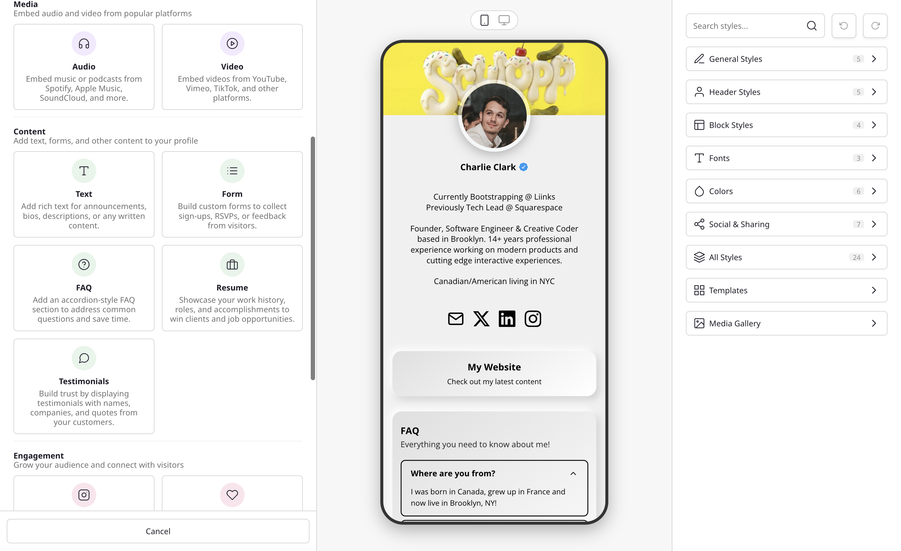
Finding the right block
The Add block picker is designed to get you to the right block quickly:
- Filter chips: Every block appears as a card with an example preview, in one grid. Chips above the grid narrow it down. All blocks shows everything, Popular shows the most-used blocks (URL button, Image button, Text, Video, Form, and Collect emails), and the rest group blocks by what you want to do: Share resources, Showcase my work, Tell my story, Connect with visitors, Build trust, and Organize my page.
- Search by keyword: Start typing in the search box at the top and the list filters to match. Search understands synonyms, so you can type what you want to do rather than the exact block name: "podcast" finds the audio embed, "CV" finds Resume, "newsletter" or "mailing list" finds Collect emails, "coupon" finds Discount code, "Calendly" finds Booking calendar, "tip" finds Donate, and "X" or "Threads" finds Follow.
- Smart paste: Paste a link or email address straight into the search box and Liinks routes it to the right block automatically. A media link (YouTube, Spotify, and similar) opens the media embed, an email address creates an email button, and a regular web link is scanned to pre-fill its title, description, and image so your block is ready to go. A pasted Calendly or Cal.com link also becomes a regular button: to show the calendar itself, pick Booking calendar instead.
Here's an overview of every block type available:
Link
The most common block type. Links can point to URLs, email addresses, files, images, or other tabs on your page. See Link Block for setup instructions.
- URL: A standard clickable link that opens a webpage.
- Email: Opens the visitor's email client with a pre-filled address.
- File: Upload and share PDFs, images, or audio files.
- Image: Display an image that opens in a lightbox when clicked. The block editor's Image section adds two options: Full bleed stretches the image edge-to-edge with no card border, and Disable click turns off the lightbox so the image is purely decorative.
- Tab: Link to another tab within your page. See Multiple tabs.
Links support multiple layout styles including buttons, thumbnails, grids, carousels, and more. See Creating a carousel for details on the carousel layout.
On any layout that shows an image, you can swap the image for an icon, an emoji, or a 3D icon instead of uploading a picture. See Link icons and 3D icons for details.
Discount Code
Share a brand or affiliate discount code as a coupon card that visitors copy with one tap.
The top of the card shows the brand, an optional logo and line of copy, and the discount as a badge, and opens your link to the offer. Below a dashed line, the code sits beside a Copy button. Each block counts copies of the code separately from clicks, visitors can swipe through several codes placed one after another, and a gate can keep the code hidden until a visitor unlocks it. See Discount Code Block for setup instructions.
Heading
A section label that helps organize your page into logical groups, listed as Divider in older articles. Give it a title to act as a section header, or leave the title empty to use it as a plain line or as blank space between groups. Heading size, line style, line position, thickness, color, and spacing are all adjustable. See Heading Block for setup instructions.
Media
Embed audio and video content directly on your page.
Supported platforms include YouTube, Vimeo, Spotify, Apple Music, Soundcloud, and more. See Embedding content for the full list of supported platforms.
The Audio and Video blocks both open this media embed flow. They're listed separately to make them easier to find. If you're not sure which one you need, paste the media link into the picker's search box and Liinks opens the same flow for you.
Text
Add rich text sections to your page, for bios, descriptions, announcements, or any written content. Formatting includes headings, bold and italic, lists, alignment, and inline links.
A Style option dresses the text as a card, a sticky note, a speech bubble, torn paper, or a chalkboard, and the paper styles come with color swatches of their own. The Sticky note card in the picker starts a Text block as a taped-on note. See Text Block for setup instructions.
Automatically display your latest Instagram posts on your Liinks page.
Connect your Instagram account and your posts will sync automatically. See Instagram Sync for setup instructions.
Collect Emails
Collect email addresses from your visitors to build your audience.
The Collect emails card in the Add block picker creates a form with a single Email field that subscribes everyone who sends it. Submitted emails are stored in Liinks and viewable on your Audience page. You can also connect Mailchimp, Klaviyo, Flodesk, or Kit to send new subscribers there automatically (see Send subscribers to your email service). See How to Collect Email Signups for details.
Folder
Group and organize blocks into collapsible sections.
Folders help keep your page tidy by letting visitors expand and collapse groups of related content. You can nest folders within folders for multi-level organization, and choose between a visible Folder on your page or an Organization Only group that keeps your admin sidebar tidy without affecting your public page. See Using Folder Blocks for more.
FAQ
Add an expandable FAQ section to your page with accordion-style question and answer pairs.
Visitors can click on any question to expand and reveal the answer. Great for reducing repetitive questions, sharing product details, or providing quick answers to common inquiries. See FAQ Block for setup instructions.
Form
Create custom forms to collect information from your visitors.
Forms support multiple field types including text, email, phone, address, dropdowns, checkboxes, ratings, and more. Choose from starter templates like Contact Form, Newsletter Signup, Event RSVP, and others to get started quickly. Turn on Create new contacts on any form with an Email field to add the people who send it to your Audience, and use Subscribe to emails to choose who is subscribed. Responses are viewable in the Forms panel. See Forms for setup instructions.
Booking Calendar
Let visitors book a call, a class, or an appointment without leaving your page.
Paste your Calendly or Cal.com link and the booking calendar sits right on your page. Choose a light, dark, or custom color scheme (on Calendly, dark and custom colors need a paid Calendly plan), and hide the event details to show only the calendar. Every confirmed booking counts as a click in your analytics. See Booking Calendar Block for setup instructions.
Resume
Display your work history in a styled card, great for freelancers, consultants, and job seekers.
Each entry includes role, company, date range, and an optional description. You can mark a role as current to show "Present" in place of the end date, add a company URL to make the company name clickable, and drag entries to reorder them. See Resume Block for setup instructions.
Testimonials
Add customer quotes with names, companies, and optional avatars to build trust on your page.
Each testimonial can include a headshot or company logo, a name and role, the quote itself, and an optional link to the original review. Entries can be reordered by dragging, and the whole card inherits your page design so it matches the rest of your blocks. See Testimonials Block for setup instructions.
Quote
Feature a single quote at full size, with a large quotation mark and an optional name and role underneath.
Where Testimonials stacks several small attributed cards, Quote gives one line the whole block: a press mention, a standout review, or a sentence that sums up your work. An optional heading can sit above it. See Quote Block for setup instructions.
Marquee
Scroll a line of text endlessly across your page, on a colored ribbon that waves as it travels or as plain text on your background.
A decorative block rather than a clickable one: set the phrase, pick a separator between repetitions, then tune size, speed, direction, and how far the text rises and falls. Good for a tagline, a motto, or a list of what you offer. See Marquee Block for setup instructions.
Timeline
Lay out a process, a roadmap, or a history as a vertical rail of steps, each with an optional eyebrow label, a title, a description, and a badge pill.
Choose numbered markers (01, 02, 03) or plain dots, drag steps to reorder them, and highlight the step that matters most to turn it into a filled card. Good for "how it works" sections, service processes, and project timelines. See Timeline Block for setup instructions.
Countdown Timer
Show a live-ticking timer that counts down to a date and time you choose, in each visitor's local timezone. Add a headline, an optional description, and an optional button.
When the timer reaches zero, you decide what happens next: show a message you write, hide the block entirely, or reveal a hidden block of your choice the moment the countdown ends. Great for product launches, drops, sales, and event registrations. See Countdown Timer Block for setup instructions.
Social Icons
Display a row of linked social media icons on your page. There are two preset variations available in the block picker:
- Follow: Show all your social profiles in one place so visitors can follow you on Instagram, TikTok, Twitter, and other platforms.
- Donate: Add donation buttons for PayPal, Venmo, and other platforms so visitors can support you.
Both use the same underlying editor where you can add, remove, and reorder the platforms you want to display. See Social Icons Block for setup instructions.