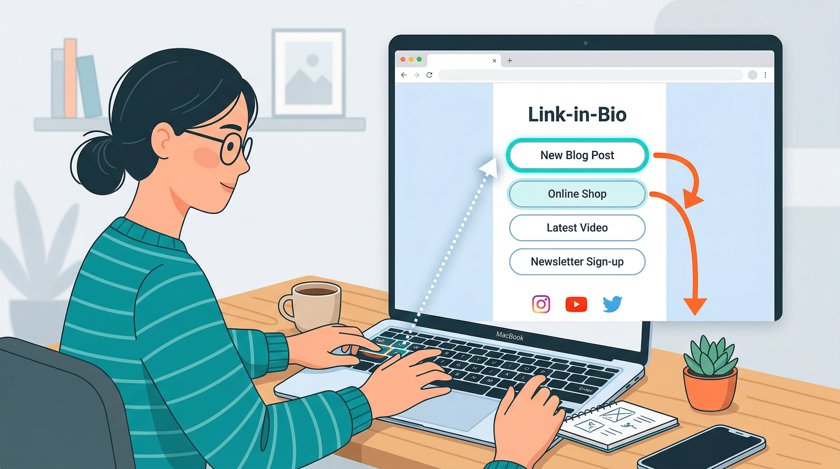
How to Make Your Link in Bio Accessible: A Step-by-Step Guide to Inclusive Design


You spent an hour picking the perfect gradient for your link in bio page. You agonized over button copy. You even swapped your profile photo three times.
But here's a question almost nobody asks: can everyone actually use it?
Not "everyone" in the vague marketing sense. Literally everyone. The person using a screen reader because they're blind. The person who can't use a mouse and navigates entirely by keyboard. The person with low vision who needs high contrast to read your button text. The person with a cognitive disability who gets overwhelmed by cluttered, unpredictable layouts.
Over one billion people globally live with some form of disability. That's roughly 16% of the world's population. And they're on Instagram, TikTok, YouTube, and LinkedIn — tapping the same "link in bio" you're tapping right now.
If your page isn't accessible, you're not just being inconsiderate. You're leaving money, followers, and opportunities on the table.
Why Accessibility Matters More Than You Think
Let's get the obvious argument out of the way first: accessibility is the right thing to do. Full stop.
But if you need a business case (and it's okay if you do — budgets are real), here it is.
The numbers are massive. The disability community and their families control over $13 trillion in annual disposable income globally. In the US alone, people with disabilities represent a market roughly the size of China's population. These aren't edge cases. These are customers.
Accessible design is better design for everyone. The curb cut effect is real. Curb cuts were designed for wheelchair users, but they help parents with strollers, delivery workers with carts, and anyone rolling luggage. The same applies to digital design. High contrast text is easier to read in bright sunlight. Clear button labels help everyone make faster decisions. Logical page structure reduces cognitive load for all visitors, not just those with disabilities.
Search engines reward it. Proper heading structure, descriptive alt text, semantic HTML — these are the same things Google uses to understand and rank your content. An accessible page is an SEO-friendly page.
Legal risk is increasing. Web accessibility lawsuits in the US have grown year over year, with over 4,000 filed annually. While most target large e-commerce sites, the legal landscape is shifting toward all digital properties. Getting ahead of this now is smart.
Step 1: Check Your Color Contrast
This is the single most impactful fix you can make, and it takes five minutes.
The Web Content Accessibility Guidelines (WCAG) require a minimum contrast ratio of 4.5:1 for normal text and 3:1 for large text (18px+ or 14px+ bold). Many link in bio pages fail this badly — light gray text on white backgrounds, pastel buttons with white labels, low-contrast accent colors that look gorgeous on your retina display but disappear on a budget Android phone in direct sunlight.
How to check:
- Open a free contrast checker like WebAIM's Contrast Checker
- Enter your background color and text color
- If the ratio is below 4.5:1 for body text, adjust until it passes
Common offenders:
- Light gray text on white backgrounds (#999 on #FFF is only 2.85:1 — fails)
- White text on pastel buttons (white on light pink, light blue, or mint green almost always fails)
- Thin, decorative fonts at small sizes (even good contrast can't save a 12px hairline font)
The fix with Liinks: When customizing your page colors in the design editor, test your button text against the button background. If you're using a light theme, dark button text is almost always the safer bet. Liinks gives you full control over button colors, text colors, and backgrounds — use that control intentionally.
Step 2: Write Descriptive Button Text
"Click here" tells a screen reader user absolutely nothing. Neither does "Learn more" repeated six times in a row.
Screen readers often let users pull up a list of all links on a page and navigate by link text alone. Imagine hearing this:
- "Click here"
- "Click here"
- "Learn more"
- "Click here"
- "Link"
That's what your page sounds like to someone using VoiceOver or NVDA if your button labels aren't descriptive.
Better examples:
- Instead of "Click here" → "Shop my presets"
- Instead of "Learn more" → "Read my latest blog post"
- Instead of "Link" → "Book a free consultation"
- Instead of "Check it out" → "Listen to Episode 47"
Each button should make sense completely out of context. If someone read only the button text with no surrounding information, would they know where it leads?
This is also just better marketing. Specific, action-oriented button copy converts better than vague labels for everyone, not just users with disabilities.
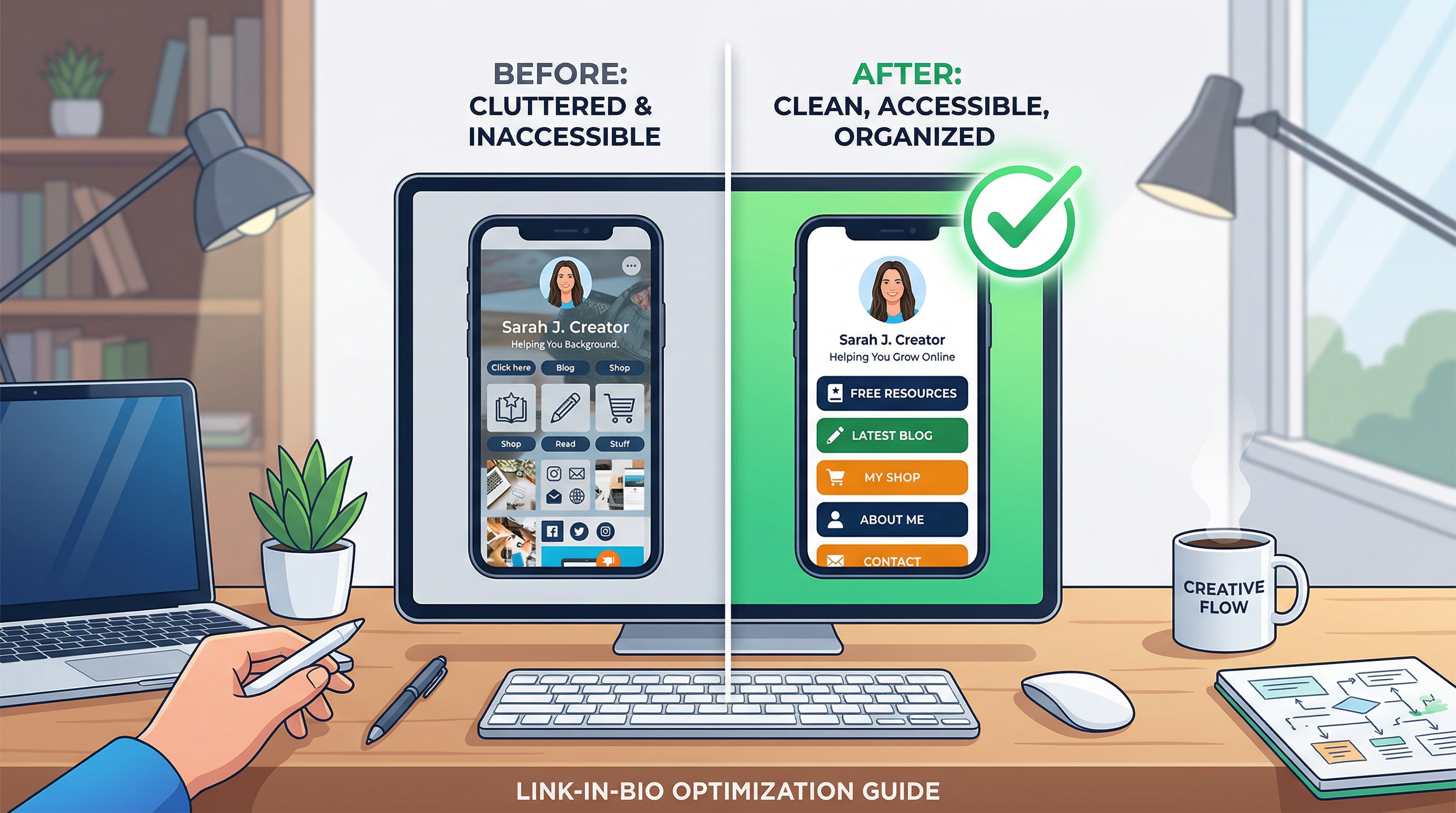
Step 3: Use a Logical Heading Structure
Your page should have a clear visual and structural hierarchy. For sighted users, this means big headings for sections and smaller text for details. For screen reader users, this means proper heading levels (H1, H2, H3) that create a navigable outline of your page.
Why it matters: Screen reader users frequently navigate by jumping between headings. If your page is a flat wall of identically-sized text with no structural hierarchy, it's like trying to find a chapter in a book with no table of contents.
What to do:
- Use your page title or name as the primary heading
- Use section headers to group related links (e.g., "My Music," "Merch," "Connect")
- Keep the hierarchy logical — don't skip from H1 to H4
Liinks supports section headers and dividers that help organize your page into logical groups. Use them. Your visitors — all of them — will navigate your page faster when content is grouped by purpose rather than dumped in a single list.
Step 4: Add Alt Text to Every Image
If your link in bio page includes images — header images, thumbnails, logos, or embedded media — every single one needs descriptive alt text.
Alt text is the text that screen readers announce when they encounter an image. It's also what displays when an image fails to load (a more common occurrence than you'd think on slow mobile connections).
How to write good alt text:
- Describe what the image shows, not what it is ("A woman holding a coffee cup and smiling at her laptop" not "Image" or "Photo")
- Keep it concise — one to two sentences is usually enough
- If the image is purely decorative (like a gradient divider), mark it as decorative so screen readers skip it
- Don't start with "Image of" or "Photo of" — screen readers already announce it as an image
For profile photos: "Headshot of [your name], smiling, wearing a blue blazer" is vastly more helpful than a blank alt attribute.
When building your Liinks page, make sure any image blocks have meaningful descriptions. This tiny effort makes a massive difference for visitors who can't see your visuals.
Step 5: Ensure Keyboard Navigation Works
Not everyone uses a mouse or touchscreen. Some people navigate entirely by keyboard — using Tab to move between interactive elements, Enter to activate buttons, and arrow keys to scroll.
Test it yourself:
- Open your link in bio page in a browser
- Put your mouse away
- Press Tab repeatedly
- Can you reach every button and link?
- Can you see which element is currently focused? (There should be a visible outline or highlight)
- Does pressing Enter on a focused button actually work?
If you can't tab through your page or can't tell where the focus is, keyboard users are stranded.
Common issues:
- Custom-styled buttons that remove the default focus outline (the
:focusring) for aesthetic reasons - JavaScript-driven interactions that only respond to clicks, not keyboard events
- Focus order that doesn't match the visual order of the page
The good news: If you're using a platform like Liinks rather than building a page from scratch, much of the keyboard navigation is handled for you at the platform level. But it's still worth testing — always verify that your specific page configuration works with keyboard-only navigation.
Step 6: Keep Your Layout Predictable
Cognitive accessibility is often overlooked, but it matters enormously. People with cognitive disabilities, attention disorders, or even just high cognitive load (we've all been there — exhausted, distracted, multitasking) benefit from predictable, consistent layouts.
What predictable means:
- Buttons look like buttons (not text links styled to look like paragraphs)
- Interactive elements are consistently styled throughout the page
- The page doesn't auto-play video or audio (this is also an issue for people with PTSD or sensory sensitivities)
- Animations are subtle, not distracting — or better yet, respect the user's "reduce motion" preference
- Information is grouped logically, not scattered randomly
What to avoid:
- Surprise pop-ups or modals
- Auto-scrolling carousels (most people don't interact with them, and they're a nightmare for screen readers)
- Inconsistent button sizes or styles that make it unclear what's clickable
- Dense walls of text with no visual breaks
A well-designed Liinks page with clear sections, consistent button styling, and logical grouping already does most of this work. The key is resisting the urge to over-design. Sometimes the most accessible page is also the simplest one.
Step 7: Test with Real Tools
You don't need to be an accessibility expert to run a basic audit. Free tools can catch the most common issues in minutes.
Quick testing checklist:
-
Browser DevTools Accessibility Audit — In Chrome, open DevTools (F12), go to the Lighthouse tab, and run an accessibility audit. It'll flag missing alt text, low contrast, missing labels, and more.
-
Screen reader test — Turn on VoiceOver (Mac: Cmd + F5) or NVDA (Windows, free download) and try to navigate your page. You'll immediately hear what's missing or confusing.
-
Keyboard test — As described in Step 5, navigate your entire page using only Tab, Enter, and arrow keys.
-
Zoom test — Zoom your browser to 200%. Does the layout still work? Can you still read everything? Does anything overlap or disappear?
-
Mobile test — Load your page on an actual phone. Tap targets should be at least 44x44 pixels. If you're struggling to hit a button with your thumb, so is everyone else.
You don't need to fix everything at once. Run the audit, prioritize the critical failures (contrast, missing alt text, broken keyboard nav), and work through the list over time.
Step 8: Make Accessibility a Habit, Not a One-Time Fix
The most common accessibility mistake isn't a technical failure. It's treating accessibility as a checklist you complete once and forget.
Every time you update your page — add a new link, swap an image, change your color scheme — you have the potential to introduce new barriers. Build accessibility checks into your update process:
- New image? Write alt text before you publish.
- New button? Make sure the label is descriptive and specific.
- New color scheme? Run the contrast checker.
- New section? Test the heading structure.
This doesn't add significant time to your workflow. It's a few extra minutes that ensure your page works for everyone, every time you touch it.
For more on maintaining a polished page without spending hours on it, check out our guide on making your Liinks page look professional without a designer.
TL;DR
Making your link in bio accessible isn't complicated, and it doesn't require sacrificing your aesthetic. Here's the quick version:
- Check color contrast — 4.5:1 minimum for text, use a free checker
- Write descriptive button text — every label should make sense on its own
- Use logical headings — create a navigable structure with sections
- Add alt text to images — describe what people would see
- Test keyboard navigation — Tab through your whole page
- Keep layouts predictable — consistent, simple, no surprises
- Test with real tools — Lighthouse, screen readers, zoom, mobile
- Make it a habit — check accessibility every time you update
These eight steps cover the vast majority of accessibility issues on link in bio pages. None of them require coding skills. All of them make your page better for every visitor, not just those with disabilities.
Build a Page That Works for Everyone
Liinks is designed to give you full control over your page's colors, layout, button styles, and structure — everything you need to build an accessible, professional page without writing a line of code. Clean section headers, customizable contrast, descriptive link labels, and a mobile-first design that respects how people actually navigate.
Your link in bio is often the first real interaction someone has with your brand. Make sure that interaction works for everyone who lands on it.
Try Liinks free and build a page that's beautiful and inclusive.